Squid Game Dominates Global TV Scene per Wikipedia Trends
The new Korean TV series Squid Game has taken the world by storm and become a global breakout phenomenon. Netflix, its distributor, announced, “Squid Game has officially reached 111 million fans—making it our biggest series launch ever!” It’s topped the charts in 90 different countries, including the United States, and has been called “a word-of-mouth global sensation” that’s flooded the news and social media.

Squid Game’s viewership growth was so rapid—and massive—that soon after its release, the show was projected to make almost $900 million from a roughly $20 million production budget, according to Bloomberg. The same report also mentions that Netflix does not reveal the details of its various data metrics.
So, how can one assess objectively such explosive popularity, especially relative to other acclaimed and trending shows?
Wikipedia as Data
Pageviews of Wikipedia articles are an interesting, independent public data source that can serve as a sensible proxy to detect popularity trends. Another typical alternative is the number of relevant search engine queries. But those are easily mixed in with other similar subjects’ searches, especially across different languages.
Wikipedia Pageview statistics is a recent project with data going back only to July 1, 2015. But it plays along with the only recent success of Squid Game I am trying to quantify. Wikipedia data is also very focused: it has both dedicated pages for TV shows and separate pages per language, and the encyclopedic quality of the content attracts and helps to evaluate the truly engaged readership—a quality generally very hard to come by.

To assess the “explosive global popularity” (or “virality” here), I will use a simple metric: the highest number of pageviews generated by a TV show in a single day, summed over nine different languages of the top language demographics of Wikipedia users. There are alternative metrics, but this one was the most interesting to me.
Why Is Squid Game Popular?
Reflecting on Squid Game’s cultural background helps to understand its breakthrough to audiences around the world. I recommend this New York Times article by Jin Yu Young, who reports from Seoul and delivers an insider’s outlook. As she points out, South Korea’s historically powerful economic growth in the postwar era made it one of the richest countries in Asia, but wealth disparity has grown too and undermined national cultural unity.
“Squid Game lays bare the irony between the social pressure to succeed in South Korea and the difficulty of doing just that,” says Shin Yeeun in the article. “It’s really difficult for people in their 20s to find a full-time job these days.” She’s a 2020 college graduate who suffered from a difficult, prolonged job search, aggravated by the COVID pandemic.
The disparity of wealth is one of the key foci in Squid Game being manifested through the deeply South Korean daily grind. At the same time, this very closely echoes the worries of the average global viewer, which helped make the show an international sensation.
Controversy, dystopian artistic visuals, violence and elements of sports and reality TV sharpen the show’s dramatic edge. And you know something is widely discussed when it’s the subject of a Saturday Night Live sketch and a New Yorker cartoon:
Collecting the Data
Identifying the most relevant data is the key first step. There are no truly consistent and open rankings for TV series, and even major players such as Netflix and Nielsen, which has a long history of producing broadcast TV ratings, might disagree about their data and analytics. Through careful examination of popular media and reported rankings, I handpicked a test sample of 10 recent shows:
- Squid Game (Netflix)
- Game of Thrones (HBO)
- Stranger Things (Netflix)
- Money Heist (Antena 3, Netflix)
- The Mandalorian (Disney+)
- The Witcher (Netflix)
- The Handmaid’s Tale (Hulu)
- Sex Education (Netflix)
- Bridgerton (Netflix)
- The Queen’s Gambit (Netflix)
They were reported as very popular by their distributing networks and various news outlets. Some of these series belong to a different network than Netflix, e.g. HBO’s Game of Thrones, and some were created in a different original language than English, e.g. the Spanish Money Heist.
Each string below is the ending of the Wikipedia hyperlink to the dedicated article about the corresponding TV show:
 Engage with the code in this post by downloading the Wolfram Notebook

✕
|
Verifying global success means one should represent at least the major global demographic groups. Wikipedia has editions in multiple languages, where articles corresponding to the same subject are not necessarily exact translations but are written from scratch by user communities speaking a particular language. According to Wikipedia, its top eight editions with the largest user communities are written in the following languages (plus I’ve added Korean, as I’ll explain):
|
✕
|
The Korean language, which has a much lower rank at 20, was added as the ninth language, so all the original languages of all shows (English, Spanish, Korean) are represented. The WikipediaData function in the Wolfram Language is a flexible, user-friendly interface for the Wikipedia API. Utilizing parallel processing on all my CPU cores, I get the time series for all our selected shows and languages:

✕
|
One needs to be very careful with the data from crowdsourcing projects such as Wikipedia. Examining the Squid Game time series, I noticed a suspiciously short line for the Chinese language. One could imagine that Asian pages would be created earlier, as Asia is the original market for the show. A thorough audit of the history of the Chinese Wikipedia page shows a disruptive change in the page URL that led to the loss of direct data access. I show the significant contribution of the lost data in black in the following plot:
 
✕
|
I recovered that data manually. Defining a function for merging time series:
|
✕
|
… I can add it to my data:

✕
|
Data Visualization
Visualizing the data requires some design considerations and further processing. First, it is useful to see how different lingual demographics contribute to the total pageviews we collected (albeit only for the nine languages). Not surprisingly, the Wikipedia English page leads in every chart. The English language is often considered an international communication language, and many people in the world use it as an important second language. The pages of English Wikipedia editions are also often the most detailed and developed. So, besides reading an article in its native language, international readers also check out its English version for more information. Hence, only the English page alone could be a proxy for “global” readership, but adding more languages with significant fractions of demographics helps improve the proxy. Removing the superfluous parts of strings helps to make plot labels more readable:

✕
|
For each show, I visualize percentages of pageviews corresponding to different languages with the help of a PieChart. Note that these percentages are only for the data of top lingual Wikipedia demographics that I accessed. There are Wikipedia pageviews for more languages, but they are relatively small:
 
✕
|
Merging all time series of a particular show across all nine languages can be done with the help of the timeSeriesMerge function I defined earlier:
|
✕
|
A single day’s maximum pageviews—the highest peaks—can be sorted to rank the TV series, at least according to the Wikipedia data available since July 1, 2015. Squid Game prevails, beating its closest rivals Game of Thrones, Stranger Things and Money Heist:

✕
|
Game of Thrones premiered on HBO in the US on April 17, 2011, and its Wikipedia page as well as some the other shows’ pages were created before Wikipedia Pageview statistics was launched. Hence, we cannot guarantee that no highest peaks happen before 2015 for these shows. Nevertheless, at the least it is quite probable for all the highest peaks to happen after 2015, as all these shows are very recent and their popularity likely grew much slower than the popularity of Squid Game.
For instance, consider Game of Thrones’s complete time series for the entire available time span:

✕
|
The peaks grow as seasons progress. Unlike Netflix’s approach of releasing all season episodes at once, one cannot binge-watch HBO series during an active season, as episodes are released weekly. So perhaps the highest viral peak for Game of Thrones was achieved when the show had its grand finale, and the critics, viewers and media were abuzz discussing it. The following functions find the highest peak in the time series together with its date of occurrence:
|
✕
|
This can be used to create a labeled diagram of peak points to use in the main plot:

✕
|
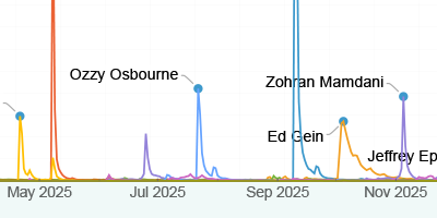
Finally, I created the data visualization at the beginning of this article:

✕
|
A Genuine Blockbuster
Squid Game is indeed a global megahit as Netflix and the media proclaim it to be, at least with respect to the demographic groups engaged enough to read about the show on Wikipedia. I can also conclude that Wikipedia Pageviews data is a great source of information. One could consider different metrics or even different data, but the general Wikipedia trends seen here align well with other reported rankings and the general public’s reception of the sampled shows.
Have you already seen Squid Game, or are you planning to see it? Let me know what you think about it in the comments!
I would like to express special thanks to Jesse Friedman, who provided valuable advice in identifying data for this project.
| Visit Wolfram Community or the Wolfram Function Repository to embark on your own computational adventures! |


Great analysis Vitaliy!
Great Post!
Should also mention Facebook and History of Japanese invasions, since these topics are implicit to the visual language, see also: https://en.m.wikipedia.org/wiki/Japanese_invasions_of_Korea_(1592–1598)