Which Is Closer: Local Beer or Local Whiskey?
In today’s blog post, we will use some of the new features of the Wolfram Language, such as language processing, geometric regions, map-making capabilities, and deploying forms to analyze and visualize the distribution of beer breweries and whiskey distilleries in the US. In particular, we want to answer the core question: for which fraction of the US is the nearest brewery further away than the nearest distillery?
Disclaimer: you may read, carry out, and modify inputs in this blog post independent of your age. Hands-on taste tests might require a certain minimal legal age (check your countries’ and states’ laws).
We start by importing two images from Wikipedia to set the theme; later we will use them on maps.

We will restrict our analysis to the lower 48 states. We get the polygon of the US and its latitude/longitude boundaries for repeated use in the following.
![]()

And we define a function that tests if a point lies within the continental US.
![]()
We start with beer. Let’s have a look at the yearly US beer production and consumption over the last few decades.

This production puts the US in second place, after China, on the world list of beer producers. (More details about the international beer economy can be found here.)

And here is a quick look at the worldwide per capita beer consumption.
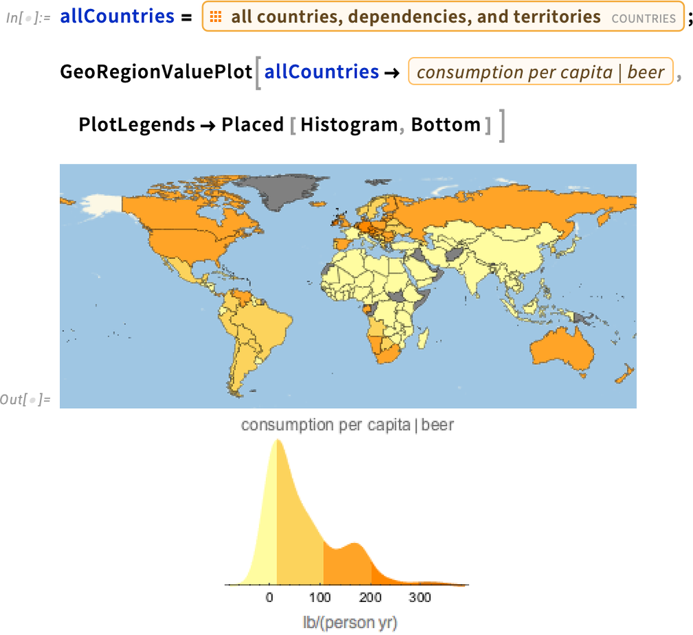
The consumption of the leading 30 countries in natural units, kegs of beer:

Some countries prefer drinking wine (see here for a detailed discussion of this subject). The following graphic shows (on a logarithmic base 2 scale) the ratio of beer consumption to wine consumption. Negative logarithmic ratios mean a higher wine consumption compared to beer consumption. (See the American Association of Wine Economists’ working paper no. 79 for a detailed study of the correlation between wine and beer consumption with GDP, mean temperature, etc.)

We start with the beer breweries. To plot and analyze, we need a list of breweries. The Wolfram Knowledgebase contains data about a lot of companies, organizations, food, geographic regions, and global beer production and consumption. But breweries are not yet part of the Wolfram Knowledgebase. With some web searching, we can more or less straightforwardly find a web page with a listing of all US breweries. We then import the data about 2600+ beer breweries in the US as a structured dataset. This is an all-time high over the last 125 years. (For a complete list of historical breweries in the US, you can become a member of the American Breweriana Association and download their full database, which also covers long-closed breweries.)
![]()
Here are a few randomly selected entries from the dataset.

We see that for each brewery, we have their name, the city where they are located, their website URL, and their phone number (the BC, BP, and similar abbreviations stand for if and what you can eat with your beer, which is irrelevant for today’s blog post).
Next, we process the data, remove breweries no longer in operation, and extract brewery names, addresses, and ZIP codes.

We now have data for 2600+ breweries.
![]()
For a geographic analysis, we resolve the ZIP codes to actual lat/long coordinates using the EntityValue function.

Unfortunately, not all ZIP codes were resolved to actual latitudes and longitudes. These are the ones where we did not successfully find a geographic location.

Why did we not find coordinates for these ZIP codes? As frequently happens with non-programmatically curated data, there are mistakes in the data, and so we will have to clean it up. The easiest way would be to simply ignore these breweries, but we can do better. These are the actual entries of the breweries with missing coordinates.
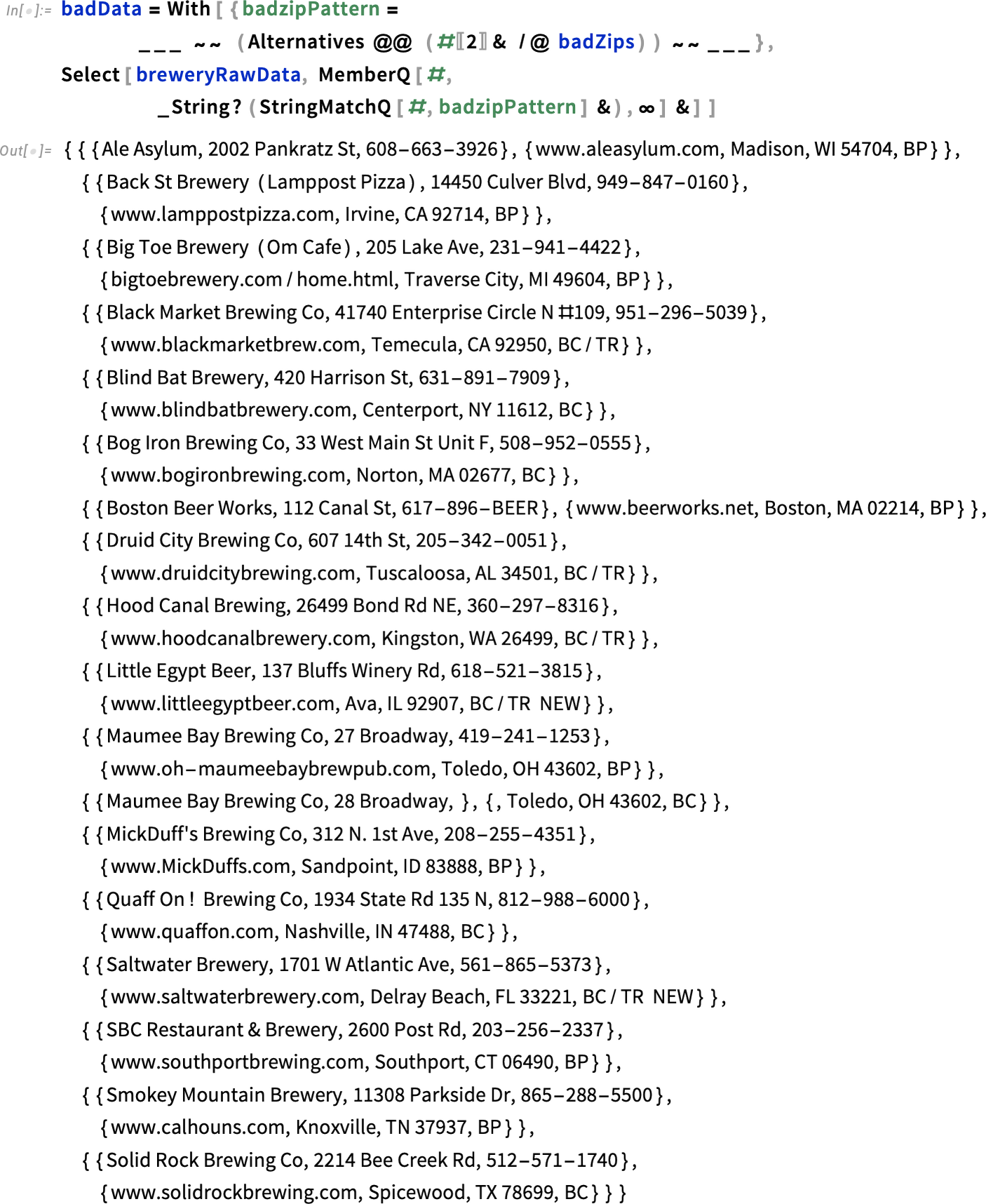
A quick check at the USPS website shows that, for instance, the first of the above ZIP codes, 54704, is not a ZIP code that the USPS recognizes and/or delivers mail to.
So no wonder the Wolfram Knowledgebase was not able to find a coordinate for this “ZIP code”. Fortunately, we can make progress in fixing the incorrect ZIP codes programmatically. Assume the nonexistent ZIP code was just a typo. Let’s find a ZIP code in Madison, WI that has a small string distance to the ZIP code 54704.

The ZIP code 53704 is in string (and Euclidean) distance as near as possible to 54704.
![]()
And taking a quick look at the company’s website confirms that 53704 is the correct ZIP code. This observation, together with the programmatic ZIP code lookups, allows us to define a function to programmatically correct the ZIP codes in case they are just simple typos.

For instance, for Black Market Brewing in Temecula, we find that the corrected ZIP code is 92590.
![]()
So, to clean the data, we perform some string replacements to get a dataset that has ZIP codes that exist.

We now acquire coordinates again for the corrected dataset.
![]()
![]()
Now we have coordinates for all breweries.
![]()
And all ZIP codes are now associated with a geographic position. (At least when I wrote the blog post; because the used website gets regularly updated, at a later point in time new typos could have occurred and the fixDataRules would have to be updated appropriately.)

Now that we have coordinates, we can make a map with all the breweries indicated.

Let’s pause for a moment and think about what goes into beer. According to the Reinheitsgebot from November 1487, it’s just malted barley, hops, and water (plus yeast). The detailed composition of water has an important influence on a beer’s taste. The water composition in turn relates to hydrogeology. (See this paper for a detailed discussion of the relation.) Carrying out a quick web search lets us find a site showing important natural springs in the US. We import the coordinates of the springs and plot them together with the breweries.


We redraw the last map, but this time add the natural springs in blue. Without trying to quantify the correlation here between breweries and springs, a visual correlation is clearly visible.

We quickly calculate a plot of the distribution of the distances of a brewery to the nearest spring from the list springPositions.


And if we connect each brewery to the nearest spring, we obtain the following graphic.


We can also have a quick look at which regions of the US can use their local barley and hops, as the Wolfram Knowledgebase knows in which US states these two plants can be grown.

(For the importance of spring water for whiskey, see this paper.) Most important for a beer’s taste is the hops (see this paper and this paper for more details). The ![]() -acids of hops give the beer its bitter taste. The most commonly occurring
-acids of hops give the beer its bitter taste. The most commonly occurring ![]() -acid in hops is humulone. (To refresh your chemistry knowledge, see the Step-by-step derivation for where to place the dots in the below diagram.)
-acid in hops is humulone. (To refresh your chemistry knowledge, see the Step-by-step derivation for where to place the dots in the below diagram.)

But let’s not be sidetracked by chemistry and instead focus in this blog post on geographic aspects relating to beer.
Historically, a relationship has existed between beer production and the church (in the form of monasteries; see “A Comprehensive History of Beer Brewing” for details). Today we don’t see a correlation (other than through population densities) between religion and beer production. Just to confirm, let’s draw a map of major churches in the US together with the breweries. At the website of the Hartford Institute, we find a listing of major churches. (Yes, it would have been fun to really draw all 110,000+ churches of the US on a map, but the blog team did not want me to spend $80–$100 to buy a US church database and support spam-encouraging companies, e.g from here or here.)

![]()
![]()

Back to the breweries. Instead of a cloud of points of individual breweries we can construct a continuous brewery probability field and plot it. This more prominently shows the hotspots of breweries in the US. To do so, we calculate a smooth kernel distribution for the brewery density in projected coordinates. We use the Sheather–Jones bandwidth estimator, which relieves us from needing to specify an explicit bandwidth. Determining the optimal bandwidth is a nontrivial calculation and will take a few minutes.
![]()
![]()


We plot the resulting distribution and map the resulting image onto a map of the US. Blue denotes a low brewery density and red a high one. Denver, Oregon, and Southern California clearly stand out as local hotspots.

The black points on top of the brewery density map are the actual brewery locations.

Using the brewery density as an elevation, we can plot the beer topography of the US. Previously unknown (beer-density) mountain ranges and peaks become visible in topographically flat areas.
![]()

The next graphic shows a map where we accumulate the brewery counts by latitude and longitude. Similar to the classic wheat belt, we see two beer belts running East to West and two beer belts running North to South.

Let’s determine the elevations of the breweries and make a histogram to see whether there is more interest in a locally grown beer at low or high elevations.
![]()
![]()
It seems that elevations between 500 and 1500 ft are most popular for places making a fresh cold barley pop (with an additional peak at around 5000 ft caused by the many breweries in the Denver region).

For further use, we summarize all relevant information about the breweries in breweryData.

We define some functions to find the nearest brewery and the distance to the nearest brewery.


Here are the nearest breweries from the Wolfram headquarters In Champaign, IL.

And here is a plot of the distances from Champaign to all breweries, sorted by size. After accounting for the breweries in the immediate neighborhood of Champaign, for the first nearly 1000 miles we see a nearly linear increase in the number of breweries with a slope of approximately 2.1 breweries/mile.


Now that we know where to find a freshly brewed beer, let’s switch focus and concentrate on whiskey distilleries. Again, after some web searching we find a web page with a listing of all distilleries in the continental US. Again, we read in the data, this time in unstructured form, extract the distillery and cities named, and carry out some data cleanup as we go.


This time, we have the name of the distillery, their website, and the city as available data. Here are some example distilleries.
![]()


![]()

A quick check shows that we did a proper job in cleaning the data and now have locations for all distilleries.
![]()
![]()
We now have a list of about 500 distilleries.
![]()
We retrieve the elevations of the cities with distilleries.
![]()

The average elevation of a distillery does not deviate much from the one for breweries.

![]()

We summarize all relevant information about the distilleries in distilleryData.

Define functions to find the nearest brewery and the distance to the nearest brewery.
![]()


We now use the function nearestDistilleries to locate the nearest distillery and make a map of the bearings to take to go to the nearest distillery.


Let’s come back to breweries. What’s the distribution by state? Here are the states with the most breweries.
![]()

If we normalize by state population, we get the following ranking.

And which city has the most breweries? We accumulate the ZIP codes by city. Here are the top dozen cities by brewery count.
![]()


And here is a more visual representation of the top 25 brewery cities. We show a beer glass over the top brewery cities whose size is proportional to the number of breweries.


![]()


Oregon isn’t a very large state, and it includes beer capital Portland, so let’s plan a trip to visit all breweries. To minimize driving, we calculate the shortest tour that visits all of the state’s breweries. (All distances are along geodesics, not driving distances on roads.)
![]()
![]()
A visit to all Oregon breweries will be a 1,720-mile drive.
![]()

And here is a sketch of the shortest trips that hit all breweries for each of the lower 48 states.


Let’s quickly make a website that lets you plan a short beer tour through your state (and maybe some neighboring states). The function makeShortestTourDisplay calculates and visualizes the shortest path. For comparison, the length of a tour with the breweries chosen in random order is also shown. The shortest path often allows us to save a factor 5…15 in driving distances.


We deploy the function makeShortestTourDisplay to let you easily plan your favorite beer state tours.

And if the reader has time to take a year off work, a visit to all breweries in the continental US is just a 41,000-mile trip.

![]()
The collected caps from such a trip could make beautiful artwork! Here is a graphic showing one of the possible tours. The color along the tour changes continuously with the spectrum, and we start in the Northeast.

On average, we would have to drive just 15 miles between two breweries.


Here is a distribution of the distances.

Such a trip covering all breweries would involve driving nearly 300 miles up and down.


Here is a plot of the height profile along the trip.

We compare the all-brewery trip with the all-distillery trip, which is still about 21,000 miles.

![]()

To calculate the distribution function for the average distance from a US citizen to the nearest brewery and similar facts, we build a list of coordinates and the population of all ZIP code regions. We will only consider the part of the population that is older than 21 years. We retrieve this data for the ~30,000 ZIP codes.
![]()

![]()
We exclude the ZIP codes that are in Alaska, Hawaii, and Guam and concentrate on the 48 states of the continental US.

We will take into account adults from the ~29,000 populated ZIP code areas with a non-vanishing number of adults totaling about 214 million people.


Now that we have a function to calculate the distance to the nearest brewery at hand and a list of positions and populations for all ZIP codes, let’s do some elementary statistics using this data.

Here is a plot of the distribution of distances from all ZIP codes to the nearest brewery.

More than 32 million Americans have a local brewery within their own ZIP code region.
![]()


While ~15% of the above-drinking-age population is located in the same ZIP code as a brewery, this does not imply zero distance to the next brewery. As a rough estimation, we will model the distribution within a ZIP code as the distance between two random points. In the spirit of the famous spherical cow, the shape of a ZIP code we will approximate as a disk. Thus, we need the size distribution of the ZIP code areas.
The average distance between two randomly selected points from a disk is approximately the radius of the disk itself.

Within our crude model, we take the areas of the cities and calculate the radius of the corresponding disk. We could do a much more refined Monte Carlo model using the actual polygons of the ZIP code regions, but for the qualitative results that we are interested in, this would be overkill.
![]()

![]()
Now, with a more refined treatment of the same ZIP code data, on average, for a US citizen in the lower 48 states, the nearest brewery is still only about 13.5 miles away.

And, modulo a scale factor, the distribution of distances to the nearest brewery is the same as the distribution above.

Let’s redo the same calculation for the distilleries.

The weighted average distance to the nearest distillery is about 30 miles for the above-drinking-age customers of the lower 48 states.


And for about 1 in 7 Americans the nearest distillery is closer then the nearest brewery.

We define a function that, for a given geographic position, calculates the distance to the nearest brewery and the nearest distillery.

E.g. if you are at Mt. Rushmore, the nearest brewery is just 18 miles away, while the nearest distillery is nearly 160 miles away.

For some visualizations to be made below, for a dense grid of points in the US, find the distance to the nearest brewery and the nearest distillery. It will take 20 minutes to calculate these 320,000 distances, so we have time to visit the nearest espresso machine in the meantime.

So, how far away can the nearest brewery be from an adult US citizen (within the lower 48 states)? We calculate the maximal distance to a brewery.

We find that the city furthest away from a freshly brewed beer is Ely in Nevada–about 170 miles away.
![]()

And here is the maximal distance to a distillery. From Redford, Texas it is about 335 miles to the nearest distillery.

![]()


Of the inhabitants of these two cities, the people from Ely have “only” a 188-mile distance to a distillery and the people from Redford are 54 miles from the next brewery.


After having found the external distance cities, the next natural question is for the city that has the maximal distance to either a brewery or a distillery.


Let’s have a look at the situation in the middle of Kansas. The ~100 adult citizens of Manter, Kansas are quite far away from a local alcoholic drink.


And here is a detailed look at the breweries/distilleries situation near Manter.

Now that we have the detailed distances for a dense grid of points over the continental US, let’s visualize this data. First, we make plots showing the distance, where blue indicates small distances and red dangerously large distances.


Using these distance plots properly projected into the US yields a more natural-looking image.


And here is the corresponding image for distilleries. Note the clearly visible great Distillery Ridge mountain range between Eastern US distilleries and Western US distilleries.

For completeness, here is the maximum of either the distance to the nearest brewery or the distance to the nearest distillery.

![]()
And here is the equivalent 3D image with the distance to the next brewery or distillery shown as vertical elevation. We also use a typical elevation plot coloring scheme for this graphic.

We can also zoom into the Big Dry Badlands mountain range to the East of Denver as an equal-distance-to-freshly-made-alcoholic-drink contour plot. The regions with a distance larger than 100 miles to the nearest brewery or distillery are emphasized with a purple background.

Or, more explicit graphically, we can use the beer and whiskey images from earlier to show the regions that are closer to a brewery than to a distillery and vice versa. In the first image, the grayed-out regions are the ones where the nearest distillery is at a smaller distance than the nearest brewery. The second image shows regions where the nearest brewery is at a smaller distance than the nearest distillery in gray.
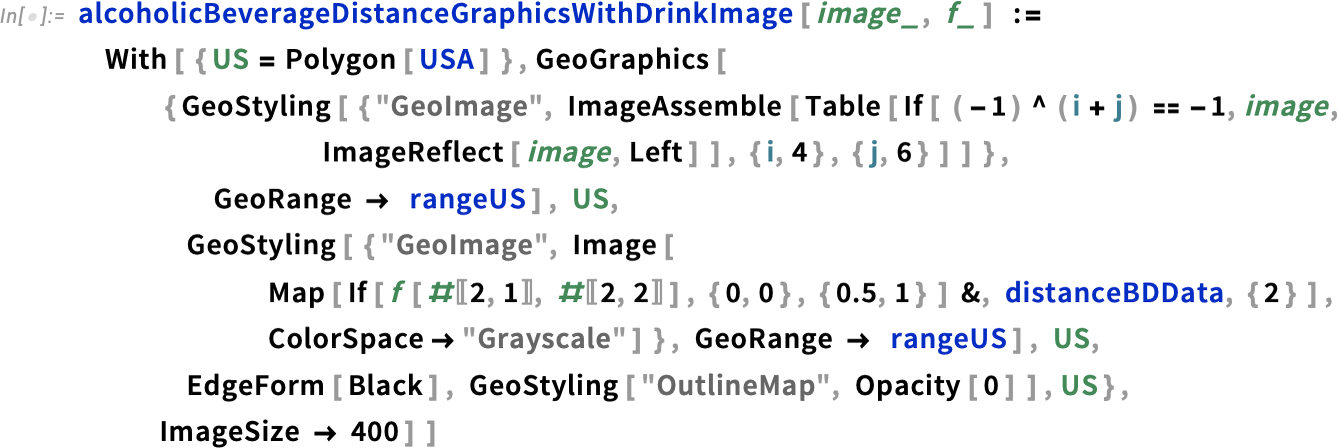


There are many more bells and whistles that we could add to these types of graphics. For instance, we could add some interactive elements to the above graphic that show details when hovering over the graphic.
![]()
![]()


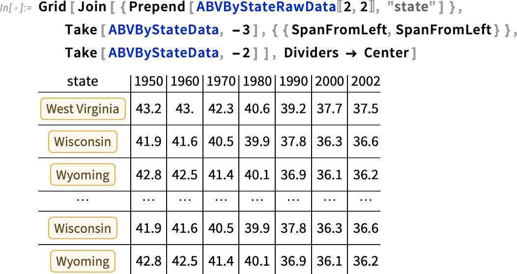
Earlier in this blog post, we constructed an infographic about beer production and consumption in the US over the last few decades. After having analyzed distillery locations, a natural question is what role whiskey plays among all spirits. This paper analyzes the average alcohol content of spirits consumed in the US over a 50+ year time span at the level of US states. If you have a subscription, you can easily import the main findings of the study, which is Table 1.

![]()
Here is a snippet of the data. The average alcohol content of the spirits consumed decreased substantially from 1950 to 2000, mainly due to a decrease in whiskey consumption.
Here is a graphical representation of the data from 1950 to 2000.

So far we have concentrated on beer- and whiskey-related issues on a geographic scale. Let’s finish with some stats and infographics on the kinds of beer produced in the breweries mapped above. Again, after some web searching, we find a page that lists the many types of beer, 160+ different styles to be precise. (See also the Handbook of Brewing and the “Brewers Association 2014 Beer Style Guidelines” for a detailed discussion of beer styles.)

We again import the data. The web page is perfectly maintained and checked, so this time we do not have to carry out any data cleanup.


How much beer one can drink depends on the alcohol content. Here is the distribution of beer styles by alcohol content. Hover over the graph to see the beer styles in the individual bins.


Beer colors are defined on a special scale called Standard Reference Method (SRM). Here is a translation of the SRM values to RGB colors.

![]()
How do beer colors correlate with alcohol content and bitterness? The following graphic shows the parameter ranges for the 160+ beer styles. Again, hover over the graph to see the beer style categories highlighted.


In an interactive 3D version, we can easily restrict the color values.

After visualizing breweries in the US and analyzing the alcohol content of beer types, what about the distribution of the actual brewed beers within the US? After doing some web searching again, we can find a website that lists breweries and the beers they brew.
So, let’s read in the beer data from the site for 2,600 breweries. We start with preparing a list of the relevant web pages.


Next, we prepare for processing the individual pages.


![]()
As this will take a while, we can display the breweries, their beers, and a link to the brewery website to entertain us in the meantime. Here is an example of what to display while waiting.

Now we process the data for all breweries. Time for another cup of coffee. To have some entertainment while processing the beers of 2,000+ breweries, we again use Monitor to display the last-analyzed brewery and their beers. We also show a clickable link to the brewery website so that the reader can choose a beer of their liking.

![]()
Here is a typical data entry. We have the brewery name, its location, and, if available, the actual beers, their classification as Lager, Bock, Doppelbock, Stout, etc., together with their alcohol content.


Here is the distribution of the number of different beers made by the breweries. To get a feeling, we will quickly import some example images.

Concretely, more than 24,400 US-made beers were listed in the just-imported web pages.

Accumulating all beers gives the following cumulative distribution of the alcohol content.


On average, a US beer has an alcohol content (by volume) of (6.7±2.1)%.

If we tally up by beer type, we get the following distribution of types. India Pale Ale is the winner, followed by American Pale Ale.
![]()

Now let’s put the places where a Hefeweizen is freshly brewed on a map.


And here are some healthy breakfast beers with oatmeal or coffee (in the name).


For the carnivorous beer drinkers, there are plenty of options. Here are samples of beers with various mammals and fish in their name. (Using Select[#&@@@Flatten[Last/@Take[brewerBeerDataUS,All],2],
DeleteCases[Interpreter["Species"][
StringSplit[#]],_Failure]=!={}&], we could get a complete list of all animal beers.)
![]()

What about the names of the individual beers? Here is the distribution of their (string) lengths. Hover over the columns to see the actual names.


Presume you plan a day trip up to 125 miles in radius (meaning not longer than about a two-hour drive in each direction). How many different beers and beer types would you encounter as a function of your starting location? Building a fast lookup for the breweries up to distance d, you can calculate these numbers for a dense set of points across the US and visualize the resulting data geographically. (For simplicity, we assume a spherical Earth for this calculation.)

![]()
![]()

![]()

In the best-case scenario, you can try about 80 different beer types realized through more than 2000 different individual beers within a 125-mile radius.

![]()


After so much work doing statistics on breweries, beer colors, beer names, etc., let’s have some real fun: let’s make some fun visualizations using the beers and logos of breweries.
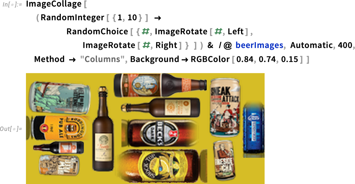
Many of the brewery homepages show images of the beers that they make. Let’s import some of these and make a delicious beer (bottle, can, glass) collage.


We continue by making a reduced version of brewerBeerDataUS that contains the breweries and URLs by state.

Fortunately, many of the brewery websites have their logo on the front page, and in many cases the image has logo in the image filename. This means a possible automated way to get images of logos is to read in the front page of the web presences of the breweries.

We will restrict our logo searches to logos that are not too wide or too tall, because we want to use them inside graphics.

We also define a small list of special-case lookups, especially for states that have only a few breweries.

Now we are ready to carry out an automated search for brewery logos. To get some variety into the vizualizations, we try to get about six different logos per state.


After removing duplicates (from breweries that brew in more than one state), we have about 240 images at hand.


A simple collage of brewery logos does not look too interesting.

So instead, let’s make some random and also symmetrized kaleidoscopic images of brewery logos. To do so, we will map the brewery logos into the polygons of a radial-symmetric arrangement of polygons. The function kaleidoscopePolygons generates such sets of polygons.

The next result shows two example sets of polygons with threefold and fourfold symmetry.

And here are two random beer logo kaleidoscopes.


Here are four symmetric beer logo kaleidoscopes of different rotational symmetry orders.


Or we could add brewery stickers onto the faces of the Wolfram|Alpha Spikey, the rhombic hexecontahedron. As the faces of a rhombic hexecontahedron are quadrilaterals, the images don’t have to be distorted very much.

Let’s end with randomly selecting a brewery logo for each state and mapping it onto the polygons of the state.

The next graphic shows some randomly selected logos from states in the Northeast.

And we finish with a brewery logo mapped onto each state of the continental US.

We will now end and leave the analysis of wineries for a future blog post. For a more detailed account of the distribution of breweries throughout the US over the last few hundred years, and a variety of other beer-related geographical topics, I recommend reading the recent book The Geography of Beer, especially the chapter “Mapping United States Breweries 1612 to 2011”. For deciding if a bottle of beer, a glass of wine, or a shot of whiskey is right for you, follow this flowchart.
Download this post as a Computable Document Format (CDF) file.
To comment, please visit the original post at the Wolfram|Alpha Blog »


