Create a Tracker to Analyze Gas Mileage Using Wolfram Tech


When I first started driving in high school, I had to pay for my own gas. Since I was also saving for college, I had to be careful about my spending, so I started manually tracking how much I was paying for gas in a spreadsheet and calculating how much gas I was using. Whenever I filled my tank, I kept the receipts and wrote down how many miles I’d traveled and how many gallons I’d used. Every few weeks, I would manually enter all of this information into the spreadsheet and plot out the costs and the amount of fuel I had used. This process helped me both visualize how much money I was spending on fuel and manage my budget.
Once I got to college, however, I got a more fuel-efficient car and my schedule got a lot busier, so I didn’t have the time to track my fuel consumption like this anymore. Now I work at Wolfram Research and I’m still really busy, but the cool thing is that I can use our company technology to more easily accomplish my automotive assessments.
After completing this easy project using the Wolfram Cloud’s web form and automated reporting capabilities, I don’t have to spend much time at all to keep track of my fuel usage and other information.
Tracking MPG with Web Forms
To start this project, I needed a way to store the data. I’ve found that the Wolfram Data Drop is a convenient way to store and access data for many of my projects.
I created a databin to store the data with just one line of Wolfram Language code:
![bin = CreateDatabin["Name" -> "MPG tracking"] bin = CreateDatabin["Name" -> "MPG tracking"]](https://content.wolfram.com/sites/39/2017/06/InOutImg110.png)
Basic Web Form
Next, I needed to design a web form that I could use to log the data to the Databin. I used FormFunction to set up a basic one to record gallons of fuel used (from filling the tank each time) and trip distance (from reading the car’s onboard computer).
I also added another field for the date and time of the trip, so that I could add data retroactively (e.g. entering data from old receipts).
I used the DateString function to create an approximate time stamp for submitting data:
![basicForm = FormFunction[ { {"TripDistance", "Trip distance (mi)"} -> Restricted["Quantity", "Miles"], {"FuelUsed", "Fuel used (gal)"} -> Restricted["Quantity", "Gallons"], {"Timestamp", "Date & Time"} -> <| "Interpreter" -> "ComputedDateTime", "Input" :> DateString[{"Month", "/", "Day", "/", "Year", " ", "Hour", ":", "Minute"}] |> }, (DatabinAdd[bin, #]; "Data submitted sucessfully!") & ] basicForm = FormFunction[ { {"TripDistance", "Trip distance (mi)"} -> Restricted["Quantity", "Miles"], {"FuelUsed", "Fuel used (gal)"} -> Restricted["Quantity", "Gallons"], {"Timestamp", "Date & Time"} -> "ComputedDateTime", "Input" :> DateString[{"Month", "/", "Day", "/", "Year", " ", "Hour", ":", "Minute"}] |> }, (DatabinAdd[bin, #]; "Data submitted sucessfully!") & ]](https://content.wolfram.com/sites/39/2017/06/InOutImg29.png)
This form works in the notebook interface, but it isn’t accessible from anywhere but my Mathematica notebook. If you want it to access it on the web or from a phone, you need to deploy it to the cloud.
Conveniently, you can do this with just one more line of code using CloudDeploy:
![coBasic = CloudDeploy[basicForm, "CarHacks/MPGTracker/BasicForm", Permissions -> "Public"] coBasic = CloudDeploy[basicForm, "CarHacks/MPGTracker/BasicForm", Permissions -> "Public"]](https://content.wolfram.com/sites/39/2017/06/InOutImg31.png)

Extended Form: More Data, Better Appearance
If that’s all you wanted to record, you could stop there. After just a few lines of code, the form created will log distance traveled and fuel used, but there’s quite a bit more data that is available while at a gas station.
A typical car’s dashboard shows average speed and odometer readings from the onboard computer. Additionally, most newer cars will report an estimation of the average gas mileage on a per-trip basis, so I designed the following form that makes it easy to test the accuracy of those readings.
I also added a field to record the location by logging the city where I am filling up with the help of Interpreter. I used $GeoLocationCity and CityData to pre-populate this field so I don’t have to type it out each time.
Finally, if you’re saving for college like I was, you’ll want to record the total price too.
All of these data points can be helpful for tracking fuel consumption, efficiency and more.
![extendedFormSpec = { {"EstimatedMPG", "Estimated gas mileage (mi/gal)"} -> Restricted["Quantity", ("Miles")/("Gallons")], {"AverageSpeed", "Average speed (mph)"} -> <| "Interpreter" -> Restricted["Quantity", ("Miles")/("Hours")], "Required" -> False, "Help" -> "(optional)" |>, {"Odometer", "Odometer (mi)"} -> Restricted["Quantity", "Miles"], {"TripDistance", "Trip distance (mi)"} -> Restricted["Quantity", "Miles"], {"TotalPrice", "Total price ($)"} -> "CurrencyAmount", {"FuelUsed", "Fuel used (gal)"} -> Restricted["Quantity", "Gallons"], "City" -> <| "Interpreter" -> "City", "Input" :> CityData[$GeoLocationCity, "FullName"], "Default" :> $GeoLocationCity, "Required" -> False, "Help" -> "(optional)" |>, {"Timestamp", "Date & Time"} -> <| "Interpreter" -> "ComputedDateTime", "Input" :> DateString[{"Month", "/", "Day", "/", "Year", " ", "Hour", ":", "Minute"}] |> }; extendedFormSpec = { {"EstimatedMPG", "Estimated gas mileage (mi/gal)"} -> Restricted["Quantity", ("Miles")/("Gallons")], {"AverageSpeed", "Average speed (mph)"} -> <| "Interpreter" -> Restricted["Quantity", ("Miles")/("Hours")], "Required" -> False, "Help" -> "(optional)" |>, {"Odometer", "Odometer (mi)"} -> Restricted["Quantity", "Miles"], {"TripDistance", "Trip distance (mi)"} -> Restricted["Quantity", "Miles"], {"TotalPrice", "Total price ($)"} -> "CurrencyAmount", {"FuelUsed", "Fuel used (gal)"} -> Restricted["Quantity", "Gallons"], "City" -> <| "Interpreter" -> "City", "Input" :> CityData[$GeoLocationCity, "FullName"], "Default" :> $GeoLocationCity, "Required" -> False, "Help" -> "(optional)" |>, {"Timestamp", "Date & Time"} -> <| "Interpreter" -> "ComputedDateTime", "Input" :> DateString[{"Month", "/", "Day", "/", "Year", " ", "Hour", ":", "Minute"}] |> };](https://content.wolfram.com/sites/39/2017/06/InOutImg41.png)
The last thing to consider before deploying the webpage is the appearance. I set up some visual improvements with the help of AppearanceRules, PageTheme, and FormFunction’s "HTMLThemed" result style:
![extendedForm = FormFunction[ extendedFormSpec, (DatabinAdd[bin, #]; "Data submitted sucessfully!") &, "HTMLThemed", AppearanceRules -> <| "Title" -> "My Car's Gas Mileage", "ItemLayout" -> "Inline" |>, PageTheme -> "Red" ]; coExtended = CloudDeploy[extendedForm, "CarHacks/MPGTracker/ExtendedForm", Permissions -> "Public"] extendedForm = FormFunction[ extendedFormSpec, (DatabinAdd[bin, #]; "Data submitted sucessfully!") &, "HTMLThemed", AppearanceRules -> <| "Title" -> "My Car's Gas Mileage", "ItemLayout" -> "Inline" |>, PageTheme -> "Red" ]; coExtended = CloudDeploy[extendedForm, "CarHacks/MPGTracker/ExtendedForm", Permissions -> "Public"]](https://content.wolfram.com/sites/39/2017/06/InOutImg51.png)

Making It Accessible
Now that I have a working form, I need to be able to access it when I’m at a gas station.
I almost always have my smartphone on me, so I can use URLShorten to make a simpler web address that I can type quickly:
![]()
Or I can avoid typing out a URL altogether by making a QR code with BarcodeImage, which I can read with my phone’s camera application:
![BarcodeImage[coExtended[[1]], "QR"] BarcodeImage[coExtended[[1]], "QR"]](https://content.wolfram.com/sites/39/2017/06/InOutImg71.png)
Once I accessed the form on my phone, I added it as a button on my home screen, which makes returning to the form when I’m at a gas station very easy:

Visualizing and Analyzing MPG Data
If you’re following along, at this point you can just start logging data by using the form; I personally have been logging this data for my car for over a year now. But what can I do with all of this data?
With the help of more than 5,000 built-in functions, including a wealth of visualization functions, the possibilities are almost limitless.
I started by querying for the data in my car’s databin with Dataset:
![]()
![binData[[-5 ;;]] binData[[-5 ;;]]](https://content.wolfram.com/sites/39/2017/06/InOutImg09-03.png)
With a few lines of code and the built-in entity framework, I can see all of the counties where I’ve traveled over the last year or so using GeoHistogram:
![Show[ GeoGraphics[{EdgeForm[Black], Polygon /@ {Entity[ "AdministrativeDivision", {"Illinois", "UnitedStates"}], Entity["AdministrativeDivision", {"Indiana", "UnitedStates"}], Entity["AdministrativeDivision", {"Wisconsin", "UnitedStates"}]}}], GeoHistogram[binData[[All, "City"]], "AdministrativeDivision2"] ] Show[ GeoGraphics[{EdgeForm[Black], Polygon /@ {Entity[ "AdministrativeDivision", {"Illinois", "UnitedStates"}], Entity["AdministrativeDivision", {"Indiana", "UnitedStates"}], Entity["AdministrativeDivision", {"Wisconsin", "UnitedStates"}]}}], GeoHistogram[binData[[All, "City"]], "AdministrativeDivision2"] ]](https://content.wolfram.com/sites/39/2017/06/InOutImg101.png)
I can also see the gas mileage over the course of the past year with TimeSeries:
![]()
![DateListPlot[timeSeries["TripDistance"]/timeSeries["FuelUsed"], PlotTheme -> "Detailed", FrameLabel -> {None, "mi/gal"}, PlotLabel -> "Gas Mileage", PlotRange -> Full, Mesh -> Full] DateListPlot[timeSeries["TripDistance"]/timeSeries["FuelUsed"], PlotTheme -> "Detailed", FrameLabel -> {None, "mi/gal"}, PlotLabel -> "Gas Mileage", PlotRange -> Full, Mesh -> Full]](https://content.wolfram.com/sites/39/2017/06/InOutImg121.png)
Analyzing Gas Mileage Factors
I often wonder what I can do to improve my gas mileage. I know that there are many factors at play here: driving habits, highway/city driving, the weather—just to name a few. With the Wolfram Language, I can see the effects of some of these on my car’s gas mileage.
I can start by looking at my average speed to compare the effects of highway and city driving and compute the correlation:
![mpgVsSpeed = Select[binData[[All, {"AverageSpeed", "EstimatedMPG"}]], FreeQ[_Missing]]; ListPlot[mpgVsSpeed, PlotTheme -> "Detailed", FrameLabel -> {Quantity[None, "Miles"/"Hours"], Quantity[None, "Miles"/"Gallons"]}, PlotLabel -> "MPG vs Average speed"] mpgVsSpeed = Select[binData[[All, {"AverageSpeed", "EstimatedMPG"}]], FreeQ[_Missing]]; ListPlot[mpgVsSpeed, PlotTheme -> "Detailed", FrameLabel -> {Quantity[None, "Miles"/"Hours"], Quantity[None, "Miles"/"Gallons"]}, PlotLabel -> "MPG vs Average speed"]](https://content.wolfram.com/sites/39/2017/06/InOutImg131.png)
![]()
It’s pretty clear from the plot that at higher average speeds, gas mileage is higher, but it does appear to eventually level off and somewhat decrease. This makes sense because although a higher average speed indicates less city driving (less stop-and-go traffic), it does require burning more fuel to maintain a higher speed. For example, on the interstate, the engine might be running above its optimal RPM, there will be more wind resistance, etc.
With the help of WeatherData, I can also see if there is a correlation with gas mileage and temperature. I can compute the mean temperature for each trip by taking the mean temperatures of each day between the times that I filled up:
![binDataWithTemperature = Dataset@BlockMap[(Append[Last[#], "Temperature" -> Mean[WeatherData[Last[#]["City"], "MeanTemperature", Append[#[[All, "Timestamp"]], "Day"], "NonMetricValue"]]]) &, Normal[binData], 2, 1]; binDataWithTemperature = Dataset@BlockMap[(Append[Last[#], "Temperature" -> Mean[WeatherData[Last[#]["City"], "MeanTemperature", Append[#[[All, "Timestamp"]], "Day"], "NonMetricValue"]]]) &, Normal[binData], 2, 1];](https://content.wolfram.com/sites/39/2017/06/InOutImg151.png)
![mpgVsTemp = binDataWithTemperature[[All, {"Temperature", "EstimatedMPG"}]]; ListPlot[mpgVsTemp, PlotTheme -> "Detailed", FrameLabel -> {Quantity[None, "DegreesFahrenheit"], Quantity[None, "Miles"/"Gallons"]}, PlotLabel -> "MPG vs Mean Temperature"] mpgVsTemp = binDataWithTemperature[[All, {"Temperature", "EstimatedMPG"}]]; ListPlot[mpgVsTemp, PlotTheme -> "Detailed", FrameLabel -> {Quantity[None, "DegreesFahrenheit"], Quantity[None, "Miles"/"Gallons"]}, PlotLabel -> "MPG vs Mean Temperature"]](https://content.wolfram.com/sites/39/2017/06/InOutImg161.png)
The correlation is weaker, but there is a relationship:
![]()
I can also visualize both correlations for the average speed and temperature in 3D space by using miles per gallon as the “height”:
![ListPointPlot3D[ Values@Select[ binDataWithTemperature[[ All, {"Temperature", "AverageSpeed", "EstimatedMPG"}]], FreeQ[_Missing]], PlotStyle -> PointSize[Large], AxesLabel -> {"Temp", "Speed", "MPG"}, Filling -> Axis, PlotTheme -> "Detailed", PlotRange -> {All, All, {15, 40}}] ListPointPlot3D[ Values@Select[ binDataWithTemperature[[ All, {"Temperature", "AverageSpeed", "EstimatedMPG"}]], FreeQ[_Missing]], PlotStyle -> PointSize[Large], AxesLabel -> {"Temp", "Speed", "MPG"}, Filling -> Axis, PlotTheme -> "Detailed", PlotRange -> {All, All, {15, 40}}]](https://content.wolfram.com/sites/39/2017/06/InOutImg18-02.png)

It’s also clear from this plot that gas mileage is positively correlated with both temperature and average speed.
Automated Reporting
Now that I have code to visualize and analyze the data, I need some way to automate this process when I’m away from my computer. For example, I can set up a template notebook that can generate reports in the cloud.
To do this, you can use CreateNotebook["Template"] or File > New > Template Notebook
(File > New > Template in the cloud).
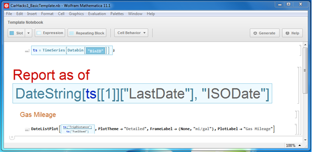
After following John Fultz’s steps in his presentation to mimic the TimeSeries plot above, I created a simple report template here:

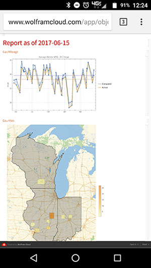
I can test the report generation locally by using GenerateDocument (or with the Generate button in the template notebook):
![SetDirectory[NotebookDirectory[]]; GenerateDocument["CarHacks1_BasicTemplate.nb", <| "BinID" -> "me8Q5puO"|>, "CarHacks1_BasicReport.nb"] SetDirectory[NotebookDirectory[]]; GenerateDocument["CarHacks1_BasicTemplate.nb", <| "BinID" -> "me8Q5puO"|>, "CarHacks1_BasicReport.nb"]](https://content.wolfram.com/sites/39/2017/06/InOutImg191.png)

From here, I can generate a report every time I submit the form by adding this code to the form’s action. But first I need to upload the template notebook to the cloud with CopyFile (alternatively, you can upload it via the web interface):
![SetDirectory[NotebookDirectory[]]; CopyFile["CarHacks1_BasicTemplate.nb", CloudObject["CarHacks/MPGTracker/BasicTemplate"]] SetOptions[%, Permissions -> "Public"]; SetDirectory[NotebookDirectory[]]; CopyFile["CarHacks1_BasicTemplate.nb", CloudObject["CarHacks/MPGTracker/BasicTemplate"]] SetOptions[%, Permissions -> "Public"];](https://content.wolfram.com/sites/39/2017/06/InOutImg201.png)
Now I can update the form to generate the report, and then use HTTPRedirect to open the report as soon as it is finished:
![automatedBasicReportForm = FormFunction[ extendedFormSpec, With[ { binID = "me8Q5puO", templatePath = "CarHacks/MPGTracker/BasicTemplate", reportOutputPath = "CarHacks/MPGTracker/BasicReport_Latest.nb" }, DatabinAdd[Databin[binID], #]; GenerateDocument[templatePath, <|"BinID" -> binID|>, reportOutputPath]; HTTPRedirect[CloudObject[reportOutputPath]] ] &, "HTMLThemed", AppearanceRules -> <| "Title" -> "My Car's Gas Mileage", "ItemLayout" -> "Inline" |>, PageTheme -> "Red" ]; CloudDeploy[automatedBasicReportForm, \ "CarHacks/MPGTracker/AutomatedBasicReportForm", Permissions -> "Public"] automatedBasicReportForm = FormFunction[ extendedFormSpec, With[ { binID = "me8Q5puO", templatePath = "CarHacks/MPGTracker/BasicTemplate", reportOutputPath = "CarHacks/MPGTracker/BasicReport_Latest.nb" }, DatabinAdd[Databin[binID], #]; GenerateDocument[templatePath, <|"BinID" -> binID|>, reportOutputPath]; HTTPRedirect[CloudObject[reportOutputPath]] ] &, "HTMLThemed", AppearanceRules -> <| "Title" -> "My Car's Gas Mileage", "ItemLayout" -> "Inline" |>, PageTheme -> "Red" ]; CloudDeploy[automatedBasicReportForm, \ "CarHacks/MPGTracker/AutomatedBasicReportForm", Permissions -> "Public"]](https://content.wolfram.com/sites/39/2017/06/InOutImg211.png)
That is a basic report. Of course, it’s easy to add more to the template, which I’ve done here, incorporating some of the plots I created before, as well as a few more. Again, I can generate the advanced report to test the template:
![SetDirectory[NotebookDirectory[]]; GenerateDocument["CarHacks1_AdvancedTemplate.nb", <| "BinID" -> "me8Q5puO"|>, "CarHacks1_AdvancedReport.nb"] SetDirectory[NotebookDirectory[]]; GenerateDocument["CarHacks1_AdvancedTemplate.nb", <| "BinID" -> "me8Q5puO"|>, "CarHacks1_AdvancedReport.nb"]](https://content.wolfram.com/sites/39/2017/06/InOutImg22-02.png)

Seeing that it works, I can upload the template to the cloud:
![automatedAdvancedReportForm = FormFunction[ extendedFormSpec, With[ { binID = "me8Q5puO", templatePath = "CarHacks/MPGTracker/AdvancedTemplate", reportOutputPath = "CarHacks/MPGTracker/AdvancedReport_Latest.nb" }, DatabinAdd[Databin[binID], #]; GenerateDocument[templatePath, <|"BinID" -> binID|>, reportOutputPath]; HTTPRedirect[CloudObject[reportOutputPath]] ] &, "HTMLThemed", AppearanceRules -> <| "Title" -> "My Car's Gas Mileage", "ItemLayout" -> "Inline" |>, PageTheme -> "Red" ]; CloudDeploy[automatedAdvancedReportForm, \ "CarHacks/MPGTracker/AutomatedReportForm", Permissions -> "Public"] automatedAdvancedReportForm = FormFunction[ extendedFormSpec, With[ { binID = "me8Q5puO", templatePath = "CarHacks/MPGTracker/AdvancedTemplate", reportOutputPath = "CarHacks/MPGTracker/AdvancedReport_Latest.nb" }, DatabinAdd[Databin[binID], #]; GenerateDocument[templatePath, <|"BinID" -> binID|>, reportOutputPath]; HTTPRedirect[CloudObject[reportOutputPath]] ] &, "HTMLThemed", AppearanceRules -> <| "Title" -> "My Car's Gas Mileage", "ItemLayout" -> "Inline" |>, PageTheme -> "Red" ]; CloudDeploy[automatedAdvancedReportForm, \ "CarHacks/MPGTracker/AutomatedReportForm", Permissions -> "Public"]](https://content.wolfram.com/sites/39/2017/06/InOutImg231.png)
Lastly, I need to update the form to use the new template and then deploy it:
![automatedAdvancedReportForm = FormFunction[ extendedFormSpec, With[ { binID = "me8Q5puO", templatePath = "CarHacks/MPGTracker/AdvancedTemplate", reportOutputPath = "CarHacks/MPGTracker/AdvancedReport_Latest.nb" }, DatabinAdd[Databin[binID], #]; GenerateDocument[templatePath, <|"BinID" -> binID|>, reportOutputPath]; HTTPRedirect[CloudObject[reportOutputPath]] ] &, "HTMLThemed", AppearanceRules -> <| "Title" -> "My Car's Gas Mileage", "ItemLayout" -> "Inline" |>, PageTheme -> "Red" ]; CloudDeploy[automatedAdvancedReportForm, \ "CarHacks/MPGTracker/AutomatedReportForm", Permissions -> "Public"] automatedAdvancedReportForm = FormFunction[ extendedFormSpec, With[ { binID = "me8Q5puO", templatePath = "CarHacks/MPGTracker/AdvancedTemplate", reportOutputPath = "CarHacks/MPGTracker/AdvancedReport_Latest.nb" }, DatabinAdd[Databin[binID], #]; GenerateDocument[templatePath, <|"BinID" -> binID|>, reportOutputPath]; HTTPRedirect[CloudObject[reportOutputPath]] ] &, "HTMLThemed", AppearanceRules -> <| "Title" -> "My Car's Gas Mileage", "ItemLayout" -> "Inline" |>, PageTheme -> "Red" ]; CloudDeploy[automatedAdvancedReportForm, \ "CarHacks/MPGTracker/AutomatedReportForm", Permissions -> "Public"]](https://content.wolfram.com/sites/39/2017/06/InOutImg241.png)
With this setup, I can always access the latest report at the URL the form redirects me to, so I find it handy to also keep it on my phone’s home screen next to the button for the form:

Conclusion
Now you can see how simple it is to use the Wolfram Language to collect and analyze data from your vehicle. I started with a web form and a databin to collect and store information. Then, for convenience, I worked on accessing these through my smartphone. In order to analyze the data, I created visualizations with relevant variables. Finally, I automated the process so that my data collection will generate updated reports as I add new data. Altogether, this is a vast improvement over the manual spreadsheet method that I used when I was in high school.
Now that you see how quick and easy it is to set this up, give it a try yourself! Factor in other variables or try different visualizations, and maybe you can find other correlations. There’s a lot you can do with just a little Wolfram Language code!
Download this post as a Computable Document Format (CDF) file. New to CDF? Get your copy for free with this one-time download.


Great article. It would be great to continue the automation by interfacing with a wireless OBD2 tool.
Fantastic post!!!
I agree with Gustavo, a follow up post with a wireless OBD2 would be great. Heck, with a few more lines of code you can make an Apple Watch app – from the screens it looks like you’re an Android user, but for the educational purpose of the post you’ll close the circle on the full capability of the language.
Great job. Keep them coming.