And Now for Our Featured Presentation…
It’s been a few weeks since we returned from San Diego, after participating in SIGGRAPH 2007—one of the most prestigious conferences around for the computer graphics crowd.
It’s no surprise how popular we’ve become there, considering that so many computer scientists, professional artists and enthusiasts use Mathematica to generate some of their most fascinating graphics. We were a big hit at the 2006 conference, with the then-upcoming Mathematica 6 in our hands. Its graphics and interactivity capabilities were stronger than ever and fit perfectly into the show.
Encouraged by that success, we decided to raise the bar this year. But while preparing for the show, we had to answer one daunting question: how could we please an audience so accustomed to the fancy graphics, animations and effects of Hollywood?
Well, the answer was obvious. Just do what Mathematica does best: working with mathematical formulas, generating algorithmic content, visualizing real-world data… These things are at the core of the system, and we knew they’d draw a lot of interest at SIGGRAPH.
Here are some of the animations that we presented.
The first, aptly named “The Demonstrations,” is a brainchild of company cofounder Theodore Gray. After finishing his video of the periodic table, he had this crazy idea of making a similar animation for the Wolfram Demonstrations Project.
Instead of using shots of all the elements, he compiled hundreds of Demonstrations in a single table using Mathematica—with each one running simultaneously! The end result was stunning (click on the image below to see for yourself).
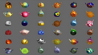
But what is a computer graphics show without the Utah Teapot? The Teapot is one of the most famous computer graphics models of all time, and people at SIGGRAPH just love to do some funny things with it.
So, we thought, why not have our own tea party—generated completely in Mathematica? Each teapot below (click for animation) represents some of Mathematica 6’s new functionality, such as arbitrary meshing, surface trimming and various coloring options.
We had also been using our old tsunami animation in various places. But we felt that it was about time to update it using new Version 6 graphics capabilities. The result? A fresh look at the way tsunamis form and evolve.
Finally, we made good use of some of our curated data, especially CityData and CountryData. The first scene of the following animation (linked from the image) shows country boundaries as well as cities around the world. The cities are colored by their populations. The greater the population, the brighter the city.
For the second scene, we used the FindShortestTour function to find the shortest path between capital cities of the world. Let the travel begin… The digits in the top left corner show actual geodetic traveling distance, in kilometers.
Like last year’s show, SIGGRAPH 2007 was a great success for us. People who are already familiar with Mathematica were excited by the quality of Version 6’s visualizations. Those who had never used Mathematica before were really impressed, and expressed their eagerness to try it in the future.
Many of them were surprised by the fact that most of these exciting examples can be generated by relatively short, easy-to-understand, intuitive Mathematica code. No fancy Hollywood studios required.
For those who are interested in how these animations are made, I will publish most of them on our Demonstrations site, so check back often.


